Hello!
I'm Ewout. I’m a designer.
With a strong belief in responsible and enjoyable design, I create user-friendly apps and websites, consistent icon sets, iconic brand identities and joyful illustrations.
Interested in working together or a just a coffee chat? Feel free to drop a message on LinkedIn or via work@ewoudt.nl.
UI Design, UX Design
Via Fabrique [merken, design & interactie]
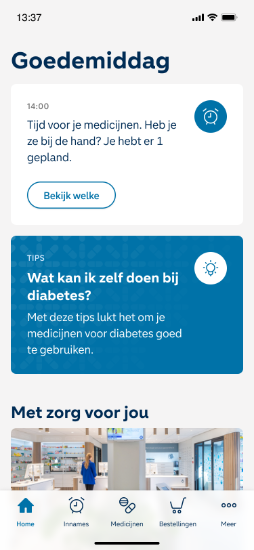
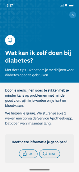
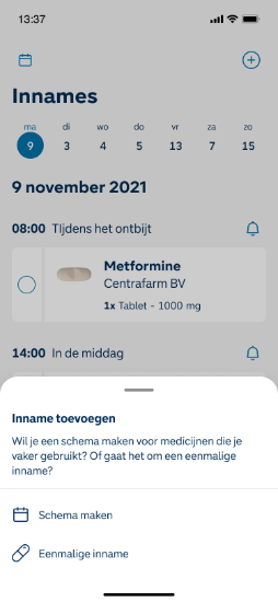
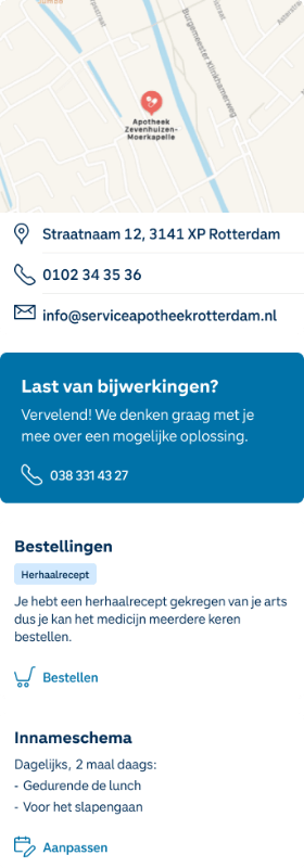
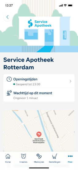
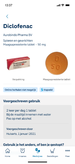
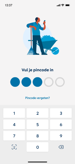
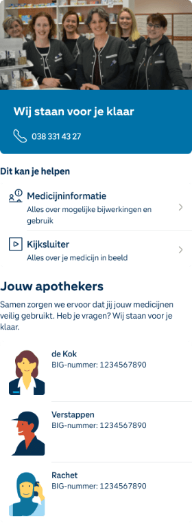
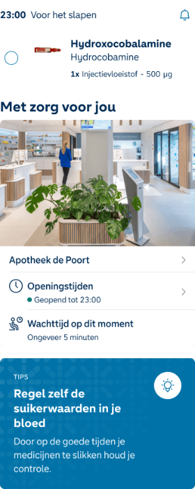
Tasked with creating a "pharmacy in your pocket" app, I took on UX and UI design. The goal was to show that a pharmacy isn't just about medicine but also about the knowledge pharmacists have about your health. The result was a comprehensive design system using design tokens and atomic design principles, along with fully designed screens for seamless use on both iOS and Android.
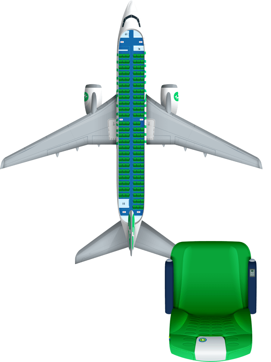
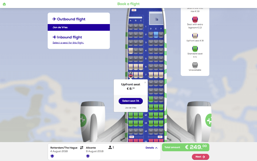
UI Design, Illustration
In response to the client's request to make travellers feel like they're truly preparing for their trip, I designed a photo-realistic seat map that provides passengers with a clear view of their aeroplane seating. This dynamic map showcases the entire aircraft and a moving landscape, complete with clouds, creating an immersive feeling of being in the sky. The result was a versatile seat map that could easily adapt to different aeroplane models and seat layouts used by Transavia.
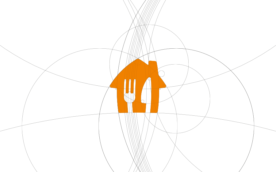
Brand Identity Design
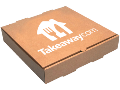
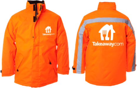
Tasked with rebranding a rapidly growing company, I created a fresh, inviting logo devoid of sharp corners and straight lines, giving it an "eatable" feel. I retained the orange colour as a nod to the company's Dutch origins. The outcome was a flexible logo system capable of adapting to various local markets with their distinct names.

Brand Identity Design, Strategy, Graphic Design
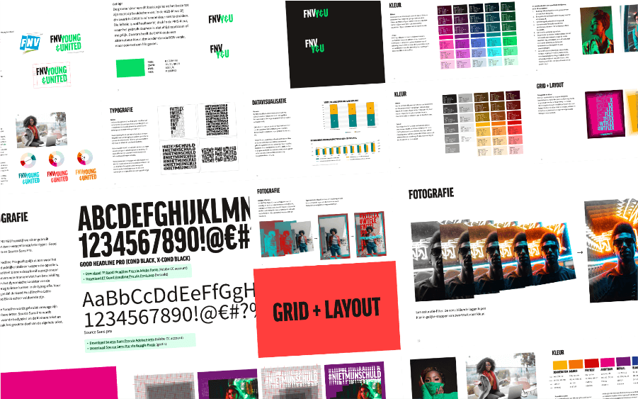
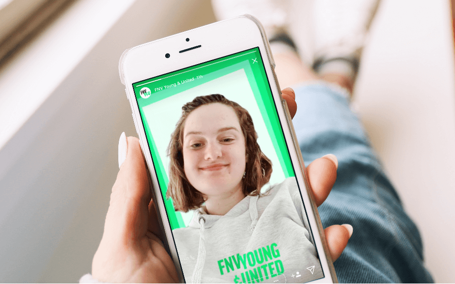
I led the transformation of the organisation's brand identity, shifting it from a protest-based to a movement-based approach. The project delivered a versatile base identity that could accommodate various campaigns, along with brand guidelines, assets, and hands-on workshops with the internal design team.

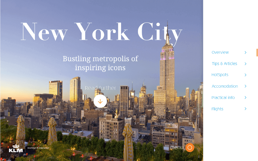
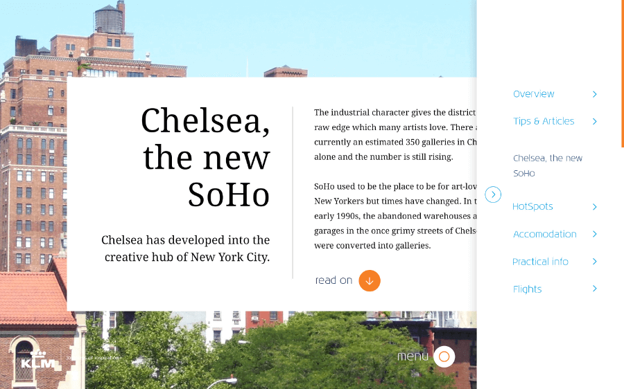
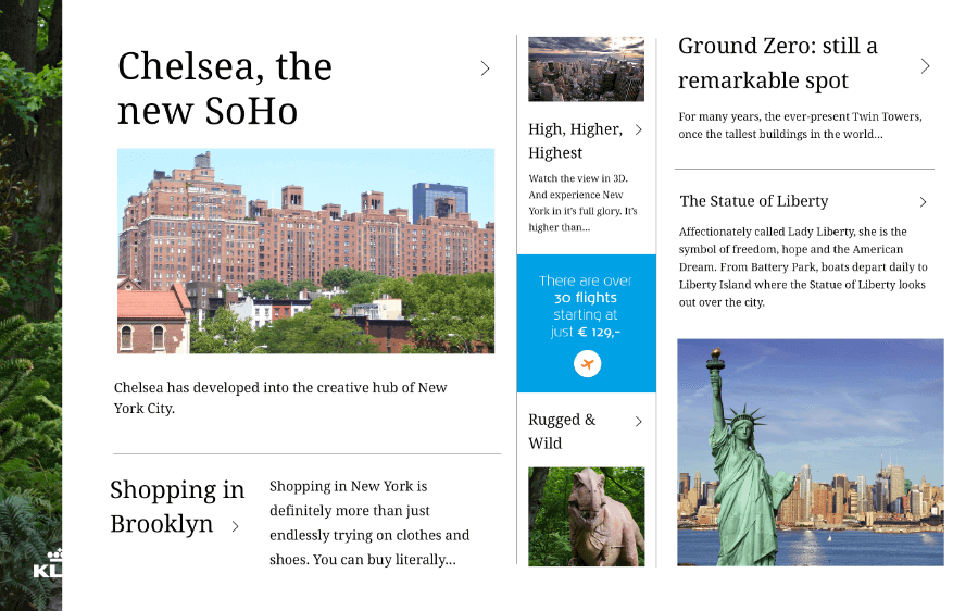
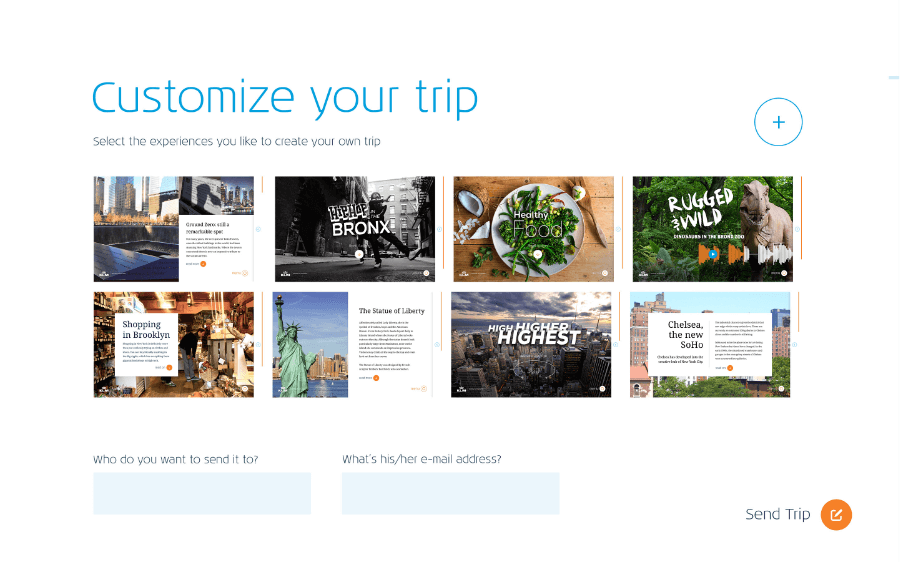
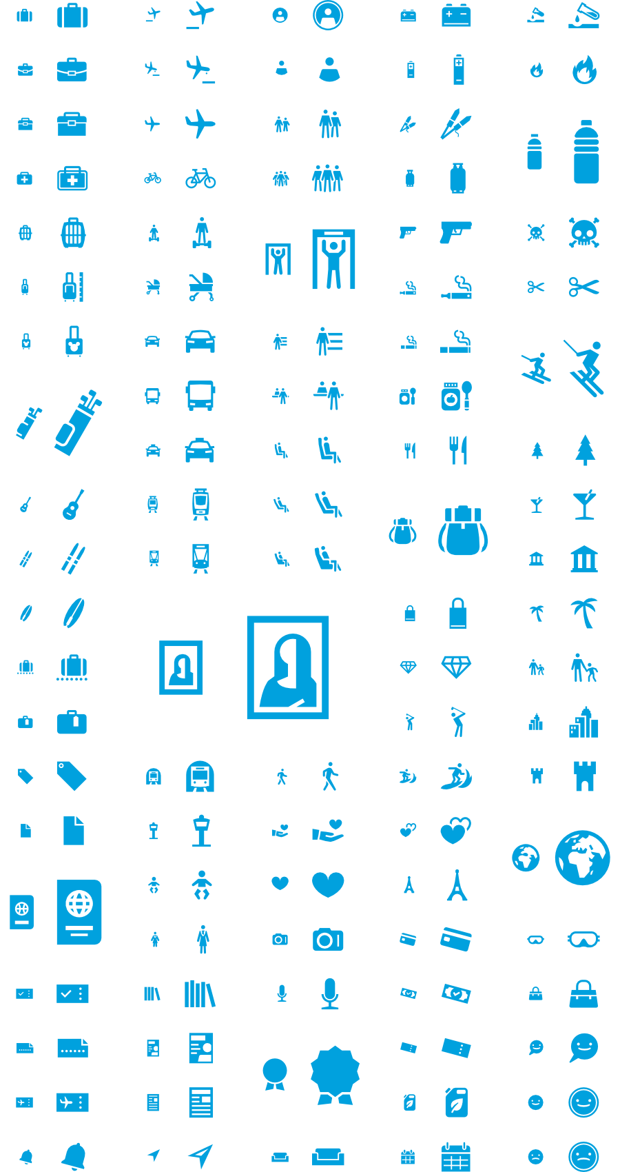
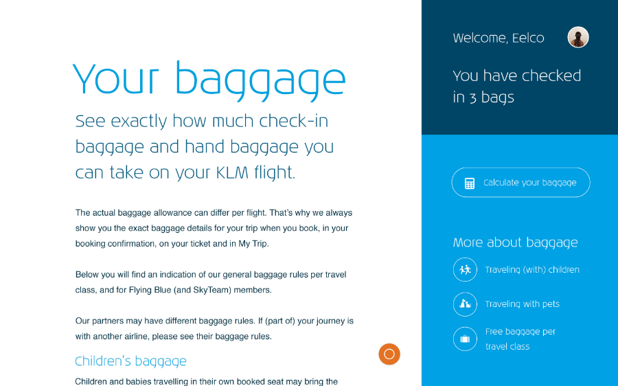
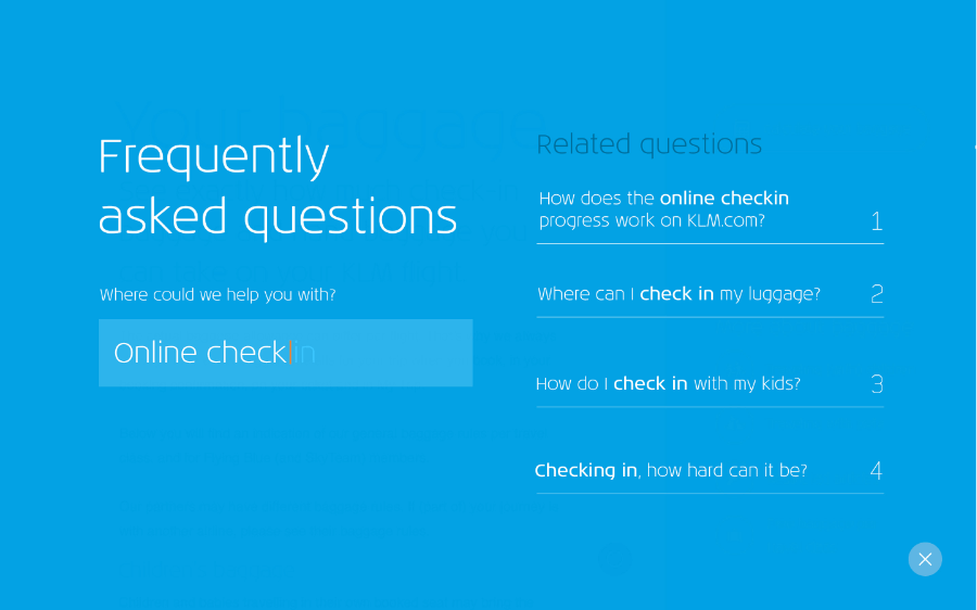
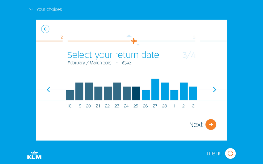
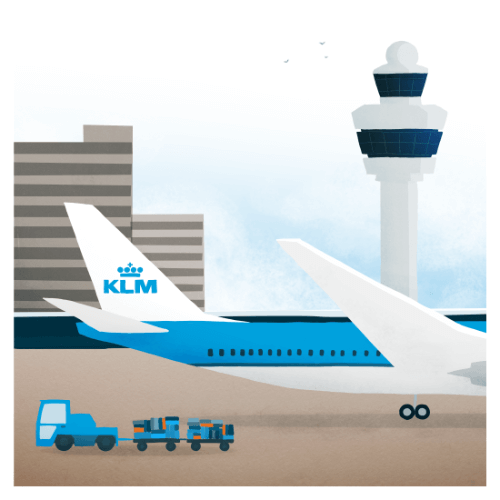
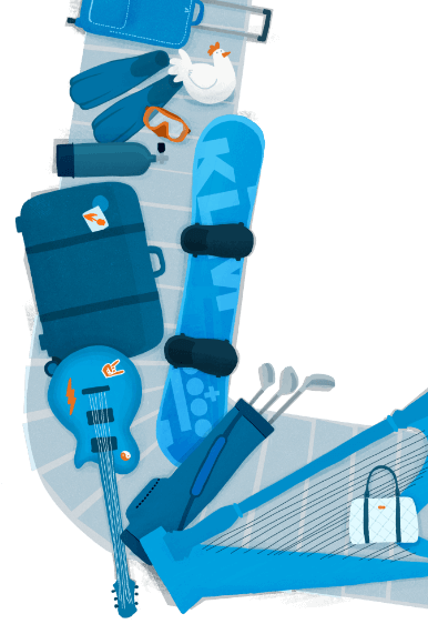
UI Design, UX Design, Icon Design, Illustration, Concept, Art Direction
To unify all digital outlets into a consistent and future-proof style, I categorised the new digital style into three interface types: inspirational, informational, and utilitarian. This approach allowed visitors to instinctively understand the type of page they were viewing and how to interact with it. It also ensured that KLM maintained a clean and recognisable look across all platforms. The project included guidelines for using the KLM brand in the digital space, a new illustration style, an extensive icon set, and workshops and masterclasses for KLM's internal designers, stakeholders, and managers.